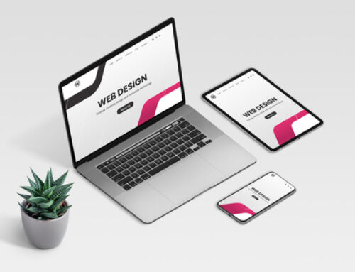
Most Charleston web design companies offer responsive web design as a part of their services. Responsive web design is a design that functions smoothly across all devices–desktops, laptops, phones, and tablets.
Before smartphones and tablets, it wasn’t necessary to include responsive web design in your business’s plans for the web. But now, it’s absolutely crucial if you want to show your customers that you care about their experience on your site–no matter where they access it from.
It’s important to design your website in a way that keeps responsive web design in mind, so here’s a list of top trends so you can recognize responsive design when you see it and know what to ask for when you’re planning your website appearance with your web design company.
5 Responsive Web Design Trends
1. Vector Graphics
It’s getting more and more popular to use vector graphics instead of raster graphics. The difference is that scalable vector graphics use points on a vector map to build a certain design, whereas a raster graphic is just a plain old image using pixels on a bitmap.
The major benefit of scalable graphics is that they can be resized without losing visual quality. The same icon graphic may appear crystal clear on both a small mobile phone screen and a large desktop screen. Vector graphics are crucial to seamless, responsive web design.
2. Hidden Menus
Hidden menus have become a trend in an effort to keep things simple. As minimal home pages become more popular, we are seeing a trend in which users must click a menu icon to reveal the website’s navigation options.
3. Single Long-Scrolling Page
Single long-scrolling pages are exactly what they sound like–a website with one main page that includes nearly all of the website’s content on that single page. Typically, these types of sites still have a navigation bar at the top of the screen, but the only difference is that when these options are clicked, the user is taken to a location already on this page (instead of a completely new webpage).
Be careful with this one if your website has a lot of content. It’s best utilized by companies with very organized and minimal website content.
4. Card-Based Design
A card-based design is a simple way to organize information into the pattern of a grid. Pieces of information are organized into “cards” in a visually appealing way, usually with a distinctive image or block of text. A card-based design is important for responsive web design because of its ability to rearrange its structure according to the user’s screen size.
5. Minimalism
You’ll notice that all 4 previously mentioned trends are about increasing simplicity.
Most current trends fall under this new idea of web design: minimalism. The goals are to reduce clutter, focus on efficient user experience, and simplify the best you can.
As it becomes more accessible for businesses to create websites and produce content, the distinguishing factor that will rule the future is simplicity. There’s no shortage of information out there, so if you can present what you have to offer in a simple and visually appealing way, you’ll be able to set yourself apart from the rest and capture your customers’ attention for good.
Charleston web design companies know this well, which is why they always insist that you include responsive design in your web planning. They know that by using it, they’ll be able to help you reach new heights with your carefully planned online presence.


