
Before the Redesign: A Functional But Dated Look
The original Commonwealth Contracting website served its purpose but lacked visual impact and user flow. Here’s what we observed:
- Outdated Visuals: While the imagery showcased quality work, the layout and design felt dated and underwhelming.
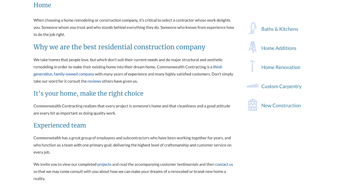
- Text-Heavy Pages: The homepage featured long blocks of text, making it difficult for visitors to quickly understand services or value propositions.
- Limited Branding: The original branding didn’t reflect the craftsmanship and quality of the company’s work, missing an opportunity to build trust with affluent homeowners.
- Hard-to-Follow Navigation: Services were listed without context, and there wasn’t a clear user journey guiding potential clients to take action.
The DigitalCoast Marketing Redesign Strategy
Our goal was to elevate Commonwealth Contracting’s brand to match the sophistication and attention to detail they bring to every project. Here’s how we approached it:
1. Modern Visual Storytelling
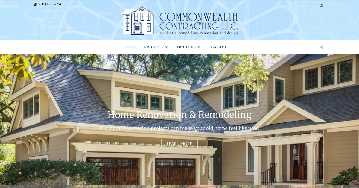
We embraced a clean, upscale design language with generous white space, high-resolution imagery, and subtle animations. Every element, from the typography to the custom icons, reflects Commonwealth’s core values: craftsmanship, reliability, and elegance.
- New Font Pairings: Modern serif and sans-serif fonts evoke professionalism and warmth.
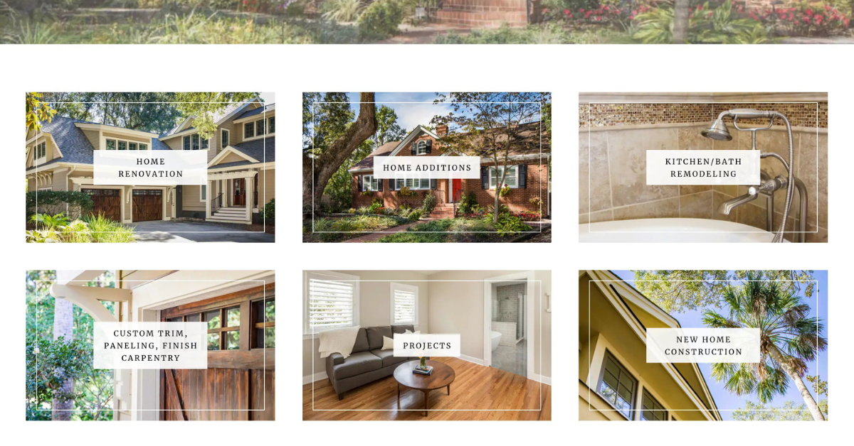
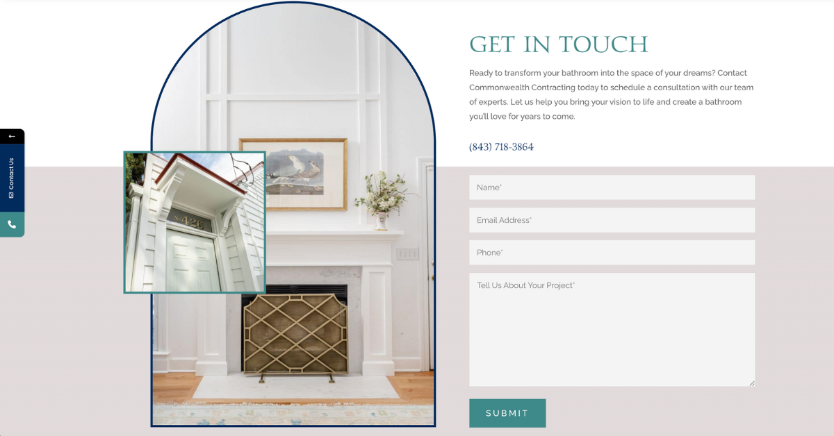
- Curved Photo Frames: Architectural arches mimic the custom builds the company is known for.
- Consistent Branding: A sophisticated color palette — rich navy, crisp white, and soft teal — reinforces trust and professionalism.

2. Improved User Experience and Flow
Rather than dumping all information on the home page, we structured the content to guide users through a visual journey:
- Strategic Sectioning: Each section (Kitchens, Additions, Bathrooms, New Builds) has its callout area with rich visuals and brief, engaging copy.
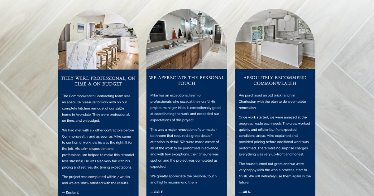
- Testimonials with Faces: We replaced flat text reviews with customer photos and quotes, adding authenticity and trust.
- Project Gallery: A visually dynamic “Recent Projects” section helps convert interest into action by showing the real-world results of Commonwealth’s work.
3. Clear Calls to Action (CTAs)
On every scroll, visitors are gently encouraged to take the next step — viewing a gallery, learning about a service, or filling out the contact form.
- Contact Form Integration: A prominent, mobile-friendly form at the bottom of the homepage encourages easy inquiries.
- Multiple CTA Buttons: Strategically placed “Let’s Start Your Project” and “See Our Work” buttons guide users deeper into the site.
4. Optimized for Conversions and SEO
We built the site on a fast, mobile-responsive framework with SEO best practices in mind.
- Keyword-Rich Headers: Each service section is optimized to attract search traffic for home remodeling, kitchen renovations, home additions, and more in the Charleston area.
- Alt Text and Metadata: All images and sections are tagged adequately for search engines, helping the site rank better over time.
- Speed and Performance: The site is lightweight and built for fast load times across all devices.
Results: A Brand That Matches the Craft
The new Commonwealth Contracting website now matches the quality of their construction work — polished, organized, and designed to convert.
Key Wins:
- Stronger first impression with high-end visuals and strategic messaging
- Increased user engagement with better structure and clear service navigation
- More qualified leads through well-placed CTAs and simplified contact forms
- Improved visibility thanks to SEO-optimized content and mobile responsiveness
Thinking About Redesigning Your Website?
If your website doesn’t reflect your brand’s excellence — or if it’s simply not bringing in the leads you expect — it may be time for a redesign. At DigitalCoast Marketing, we specialize in building websites that don’t just look good — they work hard.
Contact us to schedule a free consultation.